Redesigned, Responsive & Retina

A topic of eternal struggle for every designer - redesigning their own site. It doesn't take long for that urge to scrap everything and create a new home for your work to rear its head. For a few months now I've been tinkering with dramatically different design directions, but eventually I hit upon something that both accomplished my goals and still looked good to me the following morning.
Showing off more work
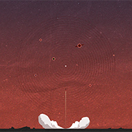
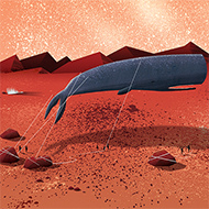
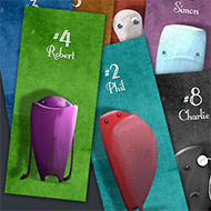
As I've added more and more pieces to the site it's become a bigger challenge for visitors to see an overview of the complete body of work. Shrinking the image size and changing the layout to show more pieces horizontally was a key starting point in the new design.
Categories
In the previous design, all my work was jumbled together and I relied on the bio text to explain to visitors which type of design work I prefer. Grouping and displaying the pieces in the three main categories, Illustration, iOS Design & Web Design, allowed me to let the work do the talking.
More love
I set about removing a lot of the copy and the clutter from the site, allowing more breathing room for the actual work. I spent a lot of time scaling back the heavy texture effects in order to make the site more of a 'canvas' and put a little more love into the subtle animations and details.
Responsive & Retina
Since buying my Retina Macbook Pro, my experience of the Internet has been a mix of drooling over incredible looking text, and disgust at images and icons. There's nothing like seeing your own work scaled up and pixely on a rMBP to give you a kick to optimise your site for retina screens. Making use of Retina.js and a few other bits of CSS trickery, I made sure everything on the site looks incredibly sharp on the rMBP, iPad and iPhone. I always feel a little let down when resizing a browser window and discovering that a site isn't responsive, especially when it could so easily be, so making sure the site scaled well was another primary goal for me.
I've got a lot of projects still in various stages of production, so make sure to follow me on Twitter to see when they're added to the site.


